
Free Colour Theory Poster | Year 5 Greater Depth | BookFlik
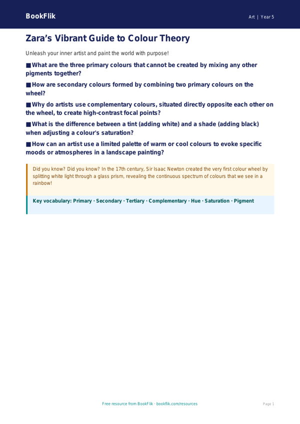
Enhance your classroom walls with our premium educational resource designed for high-achieving pupils. Our Art colour theory poster year 5 greater depth is a vibrant, informative tool crafted to deepen pupils’ understanding of chromatic relationships. This resource moves beyond basic primary and secondary colours, challenging Year 5 learners to explore complex concepts such as tertiary colours, complementary pairings, and the psychological impact of warm versus cool palettes.
This Art colour theory poster year 5 greater depth is perfectly aligned with the UK National Curriculum, which requires pupils to improve their mastery of art and design techniques. By integrating this poster into your lessons, teachers can facilitate high-level discussions regarding how artists use colour to convey mood, create focal points, and manipulate spatial depth in their work. Zara the zebra, our resident art expert, features on the poster to guide pupils through the sophisticated nuances of colour mixing and visual balance.
Designed specifically for those exceeding age-related expectations, this resource includes a section dedicated to greater depth challenges. Pupils are encouraged to go beyond simple identification and engage in critical analysis. Teachers can use the poster to launch inquiries into why specific colour schemes evoke particular emotions or how a shift in hue affects the composition of a masterpiece.
Whether used as a visual aid during practical painting sessions or as a prompt for reflective sketchbook entries, our Art colour theory poster year 5 greater depth provides the necessary scaffolding for gifted learners to thrive. The poster includes six rigorous questions designed to stretch thinking, such as: Explain why an artist might choose a split-complementary scheme to create tension; compare and contrast the effects of analogous colours versus contrasting colours; and justify your decision to use a muted palette in a landscape study. This is an essential addition to any primary classroom fostering artistic excellence.
Preview the worksheet
If the preview does not load, open the PDF in a new tab.