
Free Colour Theory Word Mat | Year 5 Greater Depth | BookFlik
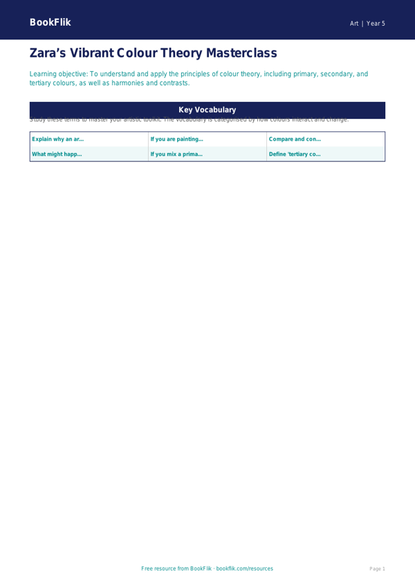
Boost your classroom creativity with our comprehensive Art colour theory word mat year 5 greater depth resource. Designed specifically for the UK National Curriculum, this high-quality educational tool is perfect for teachers looking to challenge their most able pupils. By moving beyond basic primary and secondary colours, this art colour theory word mat year 5 greater depth introduces sophisticated terminology such as tertiary colours, complementary pairings, harmonious palettes, and the psychological impact of warm and cool tones.
This resource supports Year 5 pupils in developing a refined artistic vocabulary, allowing them to critique their own work and the masterpieces of others with increased precision. Teachers can use this mat as a prompt for sketchbook annotations, a guide during practical painting sessions, or as a scaffold for complex art history discussions. The content is carefully curated to ensure that children grasp the technical aspects of colour mixing and composition, meeting the curriculum requirements for evaluating and analysing creative works.
What sets this art colour theory word mat year 5 greater depth apart is its focus on higher-order thinking. Rather than simply defining terms, it encourages students to explore the nuanced relationships between hues. The resource includes six challenging questions designed to stretch gifted and talented learners:
1. Explain why an artist might choose a monochromatic colour scheme for a portrait.
2. Compare and contrast the emotional impact of a warm-toned landscape versus a cool-toned one.
3. Justify your choice of a split-complementary palette for a piece inspired by nature.
4. What might happen if you were to desaturate your primary colours with black or white?
5. How does the concept of simultaneous contrast alter our perception of adjacent colours?
6. Create an original artwork that demonstrates your understanding of tertiary colour mixing, then write a short justification for your colour choices.
Download this essential guide today to inspire your young artists to think, create, and analyse with confidence.
Preview the worksheet
If the preview does not load, open the PDF in a new tab.